

Designing and scaling a 0→1 community driven, new contribution model across multiple product surface
Role: I led design end-to-end as the sole designer on this project, working with a PM, 6 engineers, and a data scientist. I shaped the product strategy, conducted all research, and owned every design decision from early concept through launch.
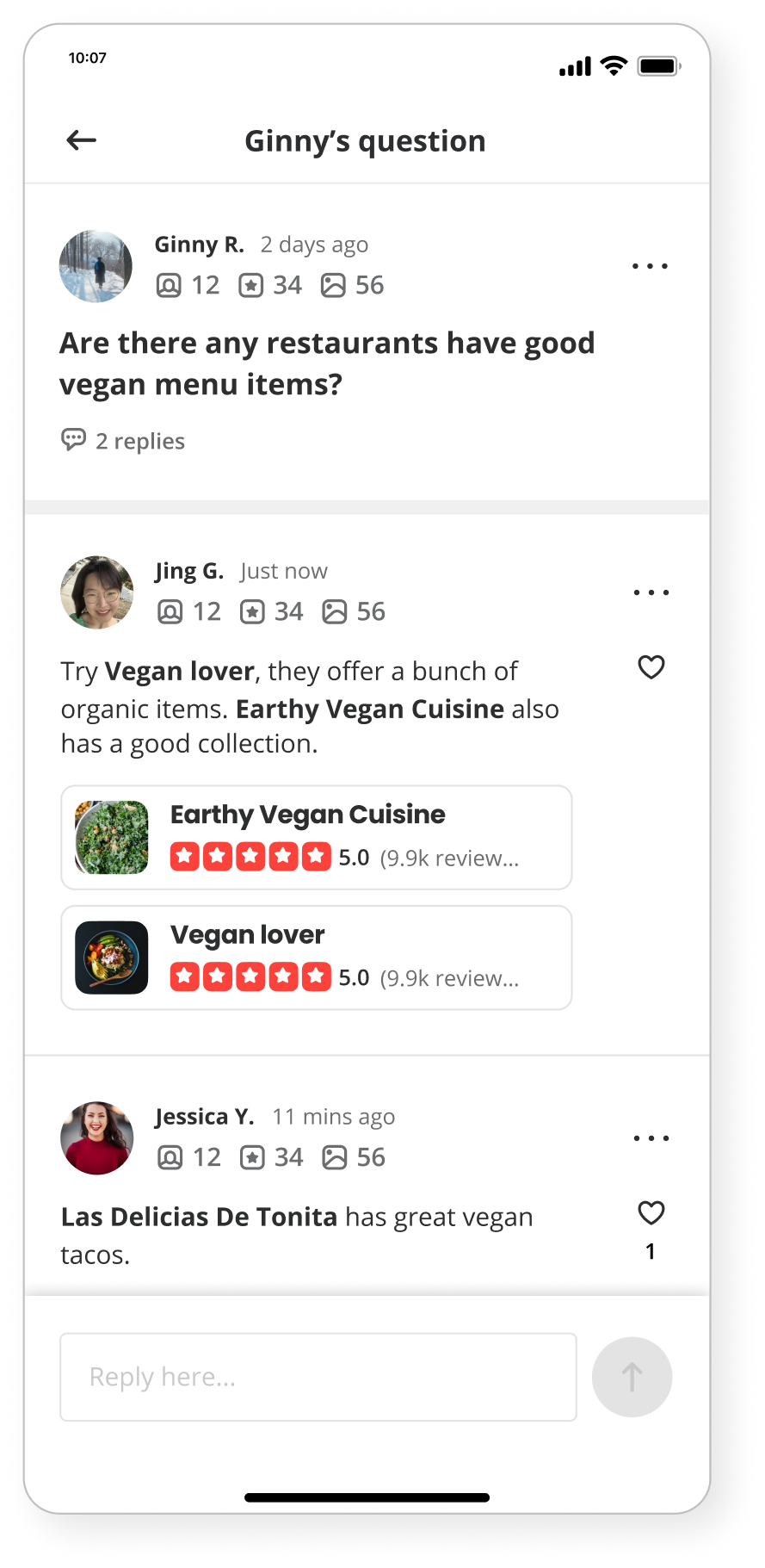
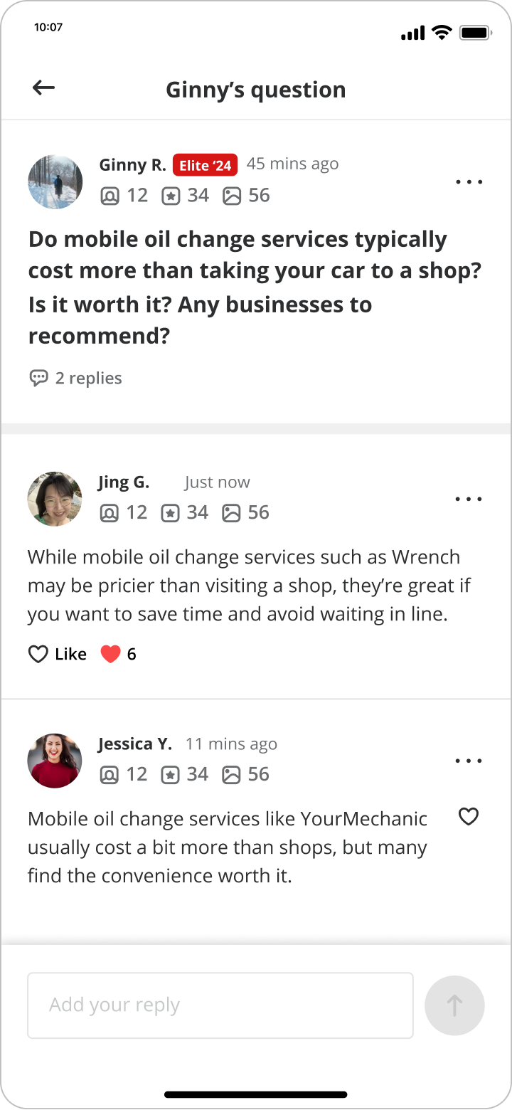
Yelp's contribution model had long centered on reviews, but reviews couldn't answer everything. People had questions that cannot be easily answered by reviews, and there was no easy way to ask or get answers from the community. At the same time, review volume was plateauing, which made finding new ways for people to contribute more urgent.
We explored whether a community driven Q&A model could:
Open up new ways for people to contribute beyond writing reviews.
Lower the barrier to participation. Asking and answering a question is quicker and easier than writing a review.
Add a layer of knowledge that works alongside reviews, not in competition with them.
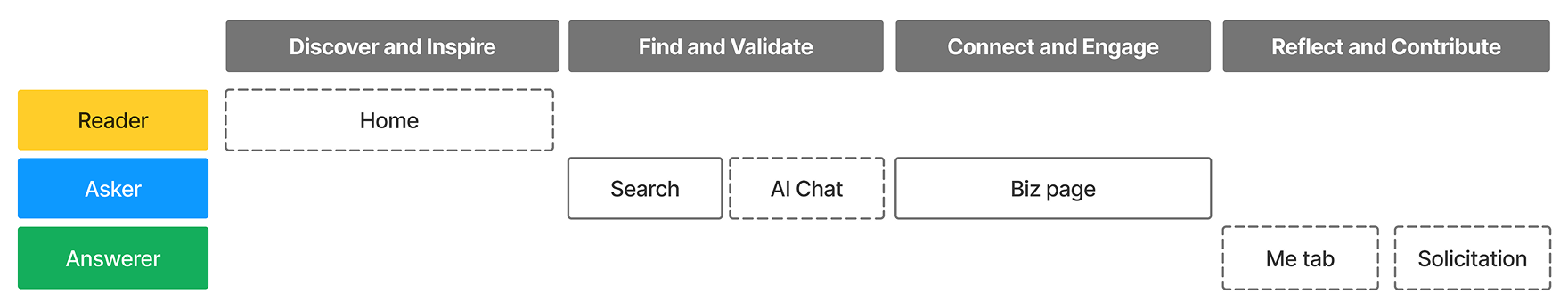
Community Q&A did not launch as a single feature. It developed in three stages — defining the vision, validating the user need, and then scaling the system.

Before building anything, the main challenge was understanding where Q&A fit within Yelp's existing experience. The risk was creating something that felt tacked on, overlapping with reviews or adding noise instead of value. This phase was about establishing the right foundation before any design decisions were made.
How can Q&A integrate into the existing experience without becoming a separate system?
Who asks questions, who answers them, and how do people move between reading and contributing?
How does a broad intent, such as searching, turn into a specific question?
This phase established a shared direction for the product: Q&A as a complementary layer. It should extend search and reviews rather than competing with them.
This phase established a shared direction for the product: Q&A as a complementary layer. It should extend search and reviews rather than competing with them.
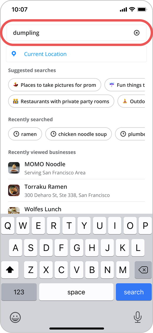
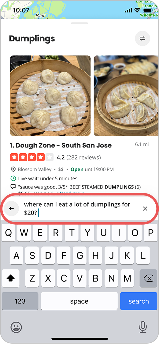
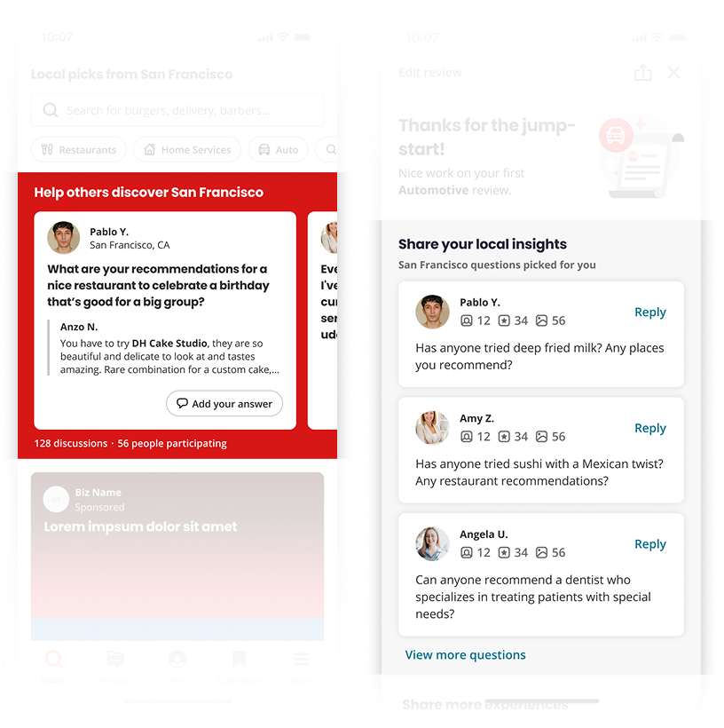
A key goal of the vision work was to surface the gaps between what Yelp currently offered and what users actually needed. The asking journey illustrates this most clearly. It's where unmet intent is most visible. I focused on two asking flows in the vision: search and AI chat. Here I'll use search as the example, since it represents the highest volume entry point for unanswered questions.
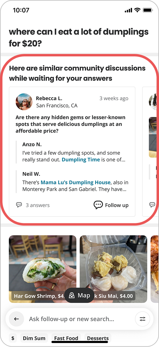
With a direction set, the next question was: would people actually use this? The pilot was designed to test whether Q&A felt natural within Yelp: whether users would ask and answer questions without us needing to force the behavior.
Introduced a consistent structure for questions and replies
Supported both asking and answering
Identified discovery and contribution entry points
Tested Q&A within existing product flows
I prioritized consistency over customization — keeping Q&A close to Yelp's existing interaction patterns so it felt familiar, not foreign. This reduced friction and made it easier for people to participate for the first time.
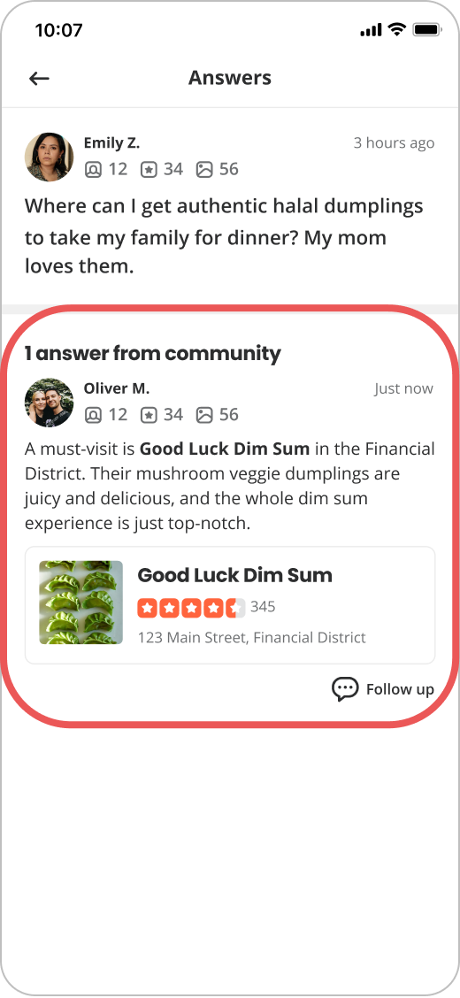
Prompt user to ask questions on SERP
Solicit answers on Home and Post Review Screen
Established a clear, consistent interaction model for asking and answering
Validated that the structure held up across both contribution types
Created a stable foundation to build on in Stage 3
will be elaborated in the next section - design deep dive
Once we confirmed that people genuinely wanted to ask and answer questions on Yelp, the challenge shifted. It was no longer about proving the concept — it was about making sure the system could grow without breaking down. I focused on scaling Q&A consistently across surfaces while keeping the experience coherent.
Converting search queries into questions
Streamlining the reply experience
Reducing cognitive load throughout the flow
Expanding Q&A to Web and Android
Introducing email and push notifications
Adding more entry points to improve discoverability
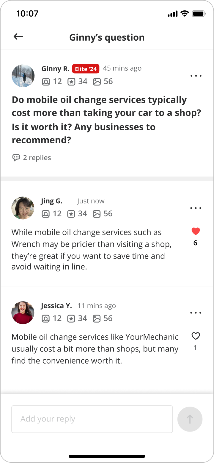
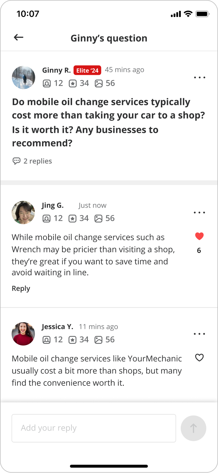
Lightweight reactions to close the loop
Lightweight reactions to close the loop
Establishing the Community Q&A Hub as a central destination
These initiatives span multiple layers of product design — from shifting user behavior and integrating systems, to refining contribution quality and feedback mechanics.
[Growth level] - Convert search query to community question
[Systems building] - Community Hub
[Interaction craft] - Biz tagging + Biz prompting
[Feedback mechanism] - “Love” a reply

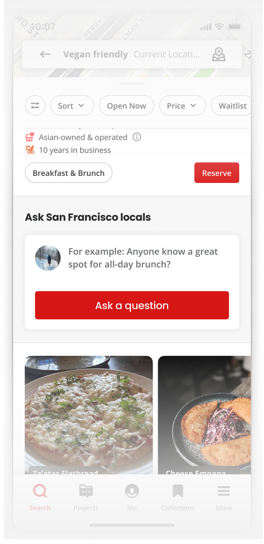
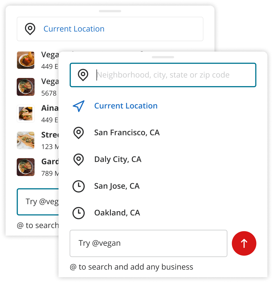
Many searches on Yelp were actually questions, but there was high friction for users to turn that intent into a community interaction
Shift the experience from transactional search to conversational asking
Reduce the effort of composing a complete question
Balance getting more contributions with keeping content quality high
Align across Search, AI, and Ranking teams who all had a stake in this surface
Keep question creation lightweight and in context, so it didn't feel like a detour
Use progressive prompting only when the user's intent was unclear, to avoid interrupting confident searches
Make the human element visible: real answers from real people, distinct from search results or AI chat
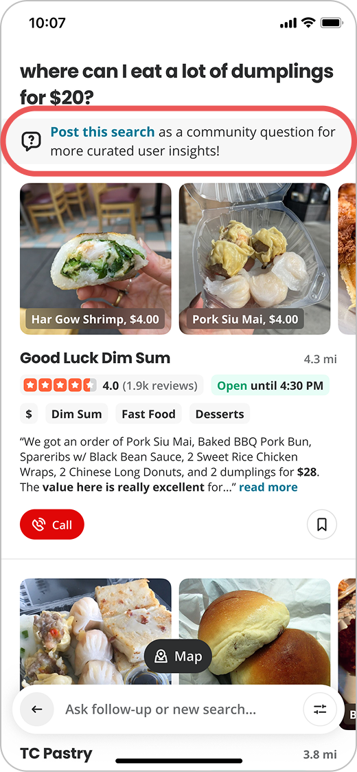
Built a mechanism that recognized when a search looked like a question and offered to convert it
Designed a lightweight question creation flow to minimize the effort of asking
Aligned the experience with how people think about search, so the transition felt natural
Shifted the experience from passively browsing results to actively starting a conversation

Increased both the rate and quality of questions submitted
Turned a passive search behavior into active community participation
Created a reusable pattern for intent-to-contribution conversion that could scale across other surfaces

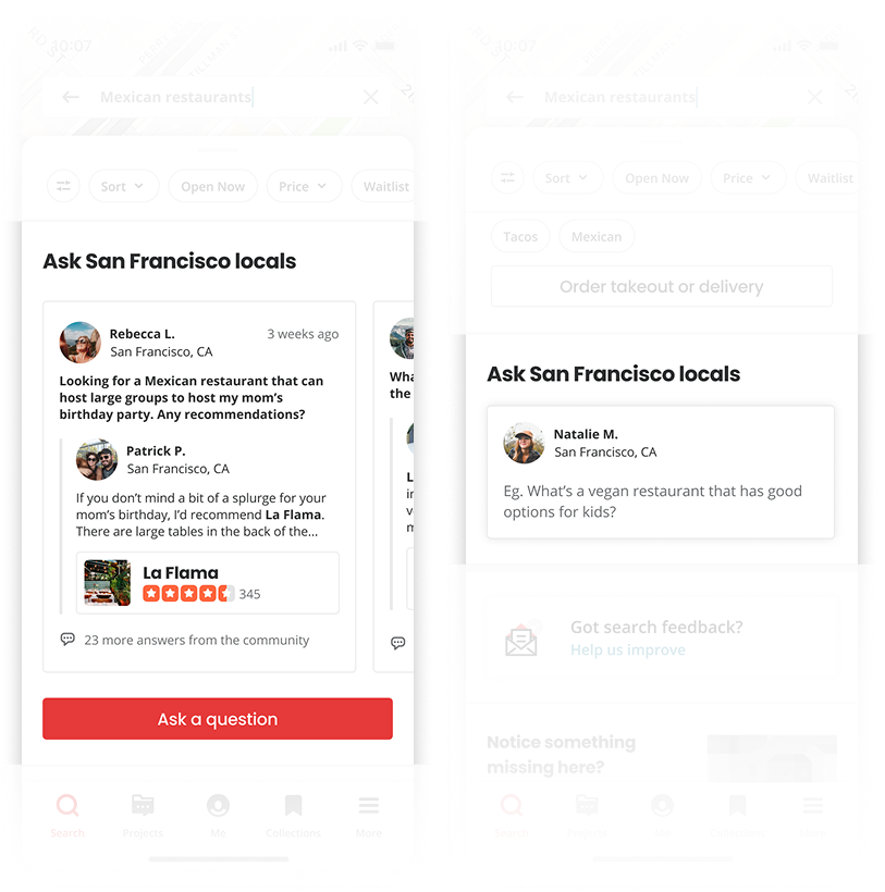
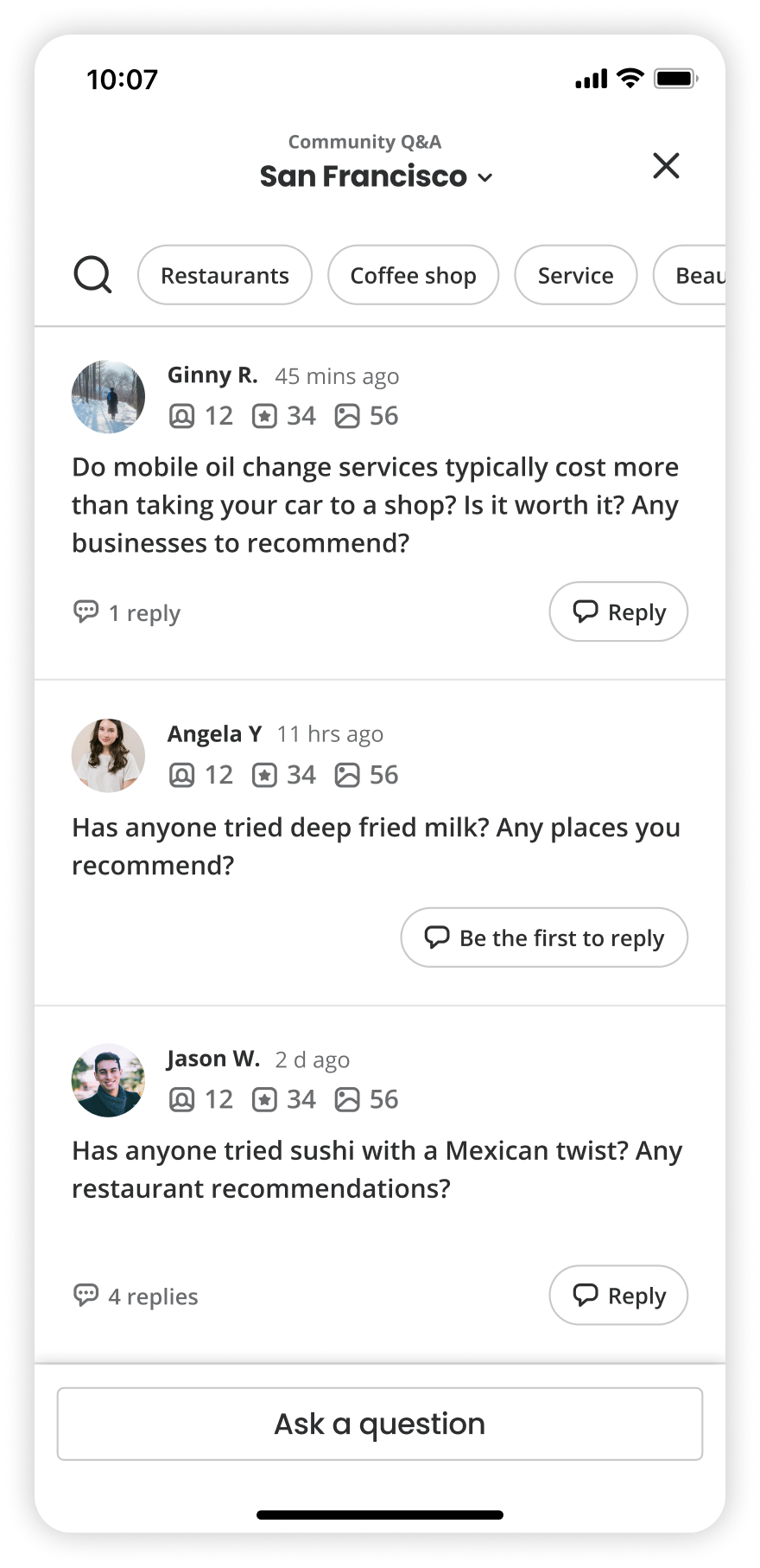
As Q&A expanded across the product, the content became scattered. There was no single place to browse, revisit, or engage with questions. It makes the experience feel fragmented and easy to miss.
How can Q&A integrate into the existing experience without becoming a separate system?
Who asks questions, who answers them, and how do people move between reading and contributing?
Built a dedicated hub where users could browse, revisit, and engage with all Q&A content in one place
Added Q&A hub entry points across key surfaces — Home, Yelp Assistant, Business pages, etc.
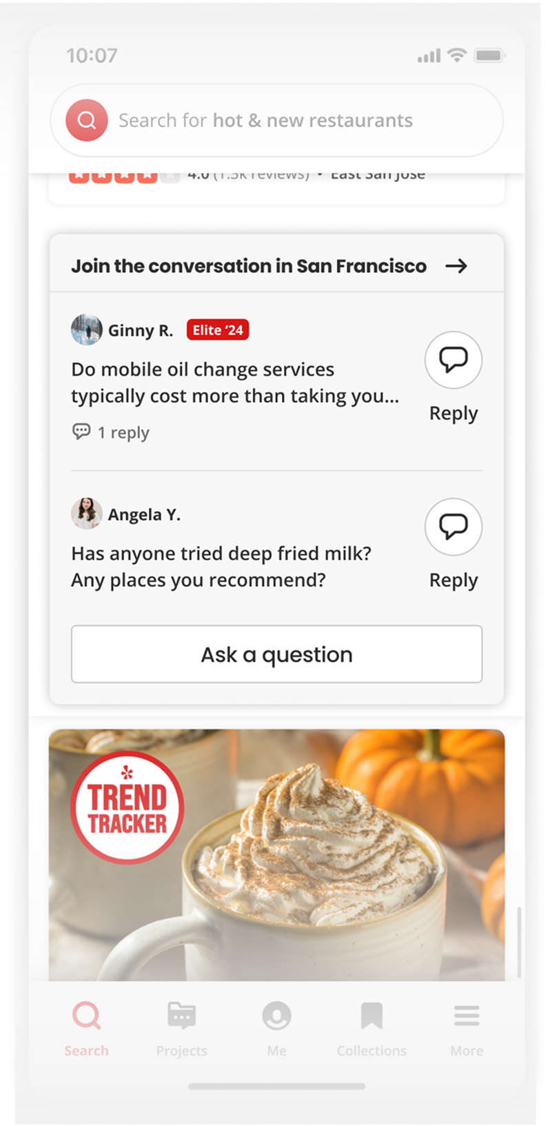
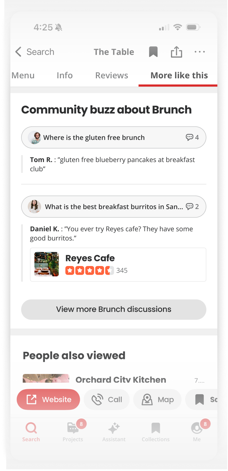
Increased Q&A visibility across the app, which drove higher engagement and answer rates
Improved retention by giving users a reliable place to return to their questions and activity
Laid the structural foundation for a scalable community ecosystem

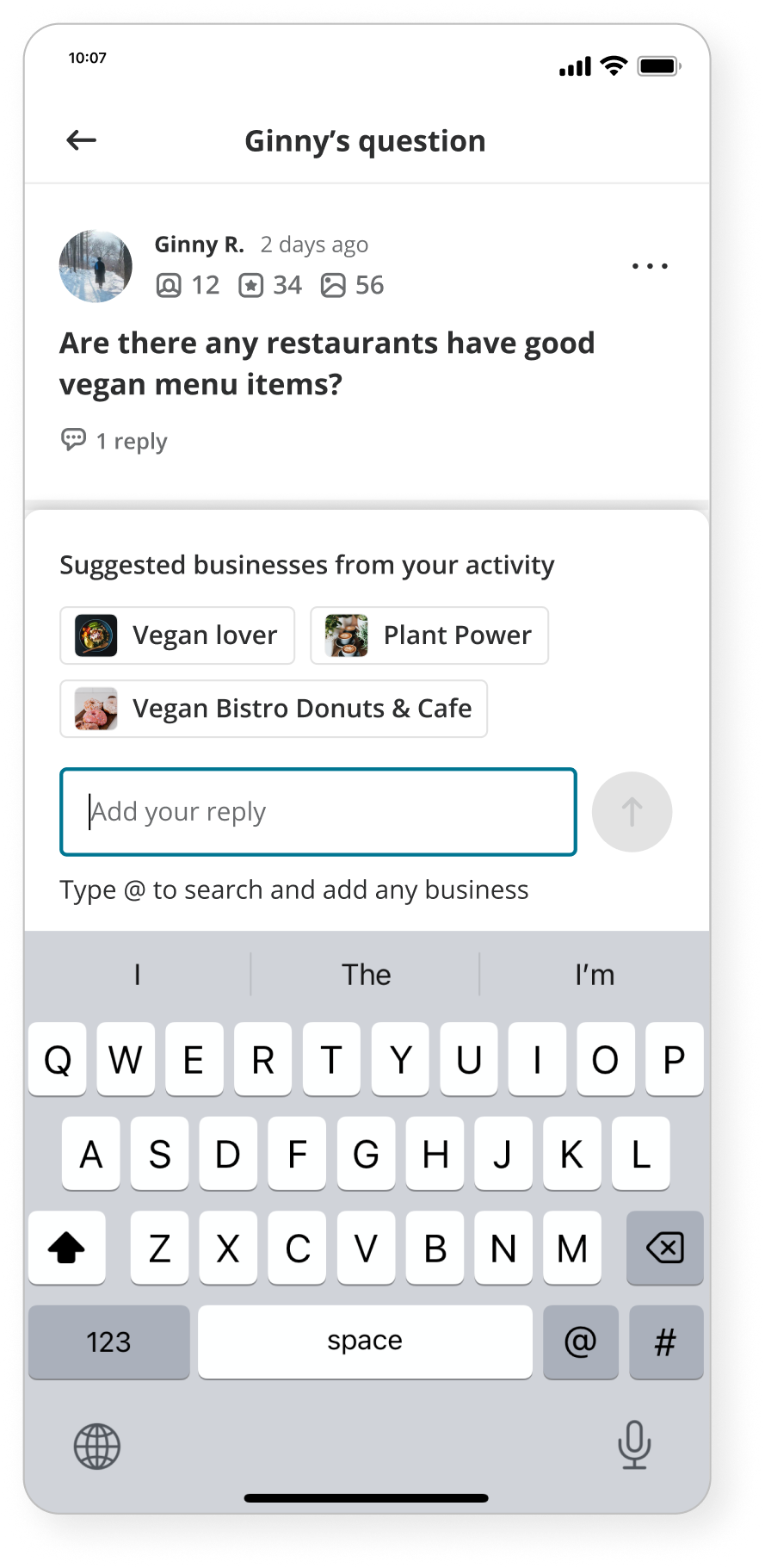
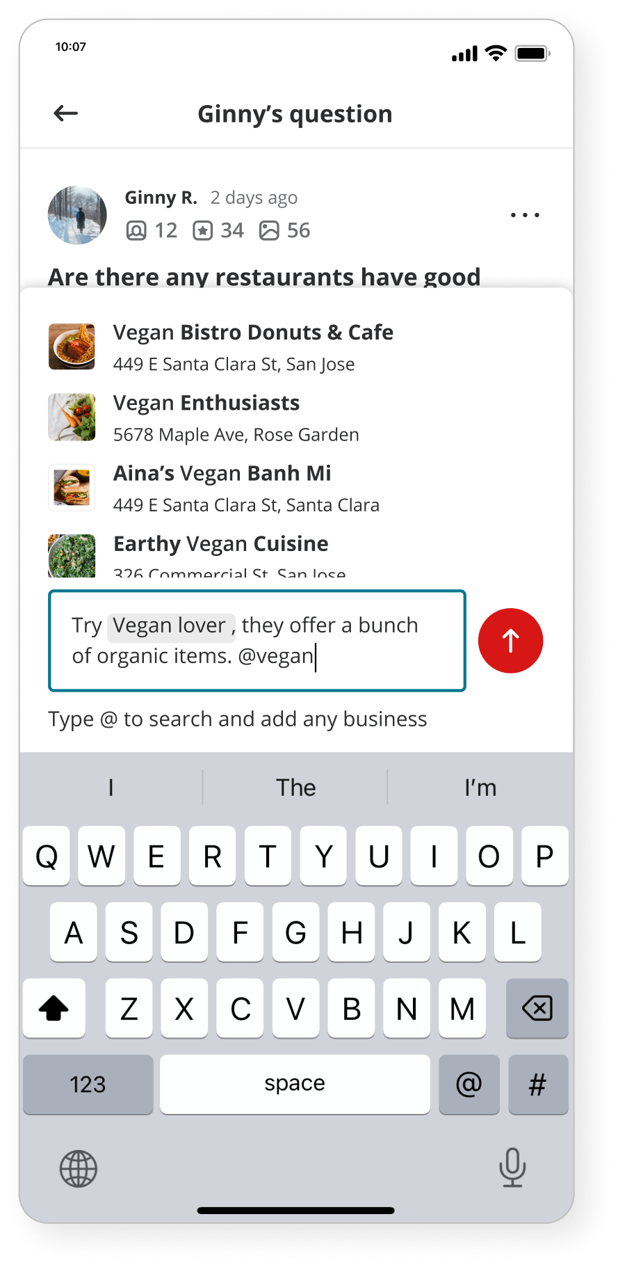
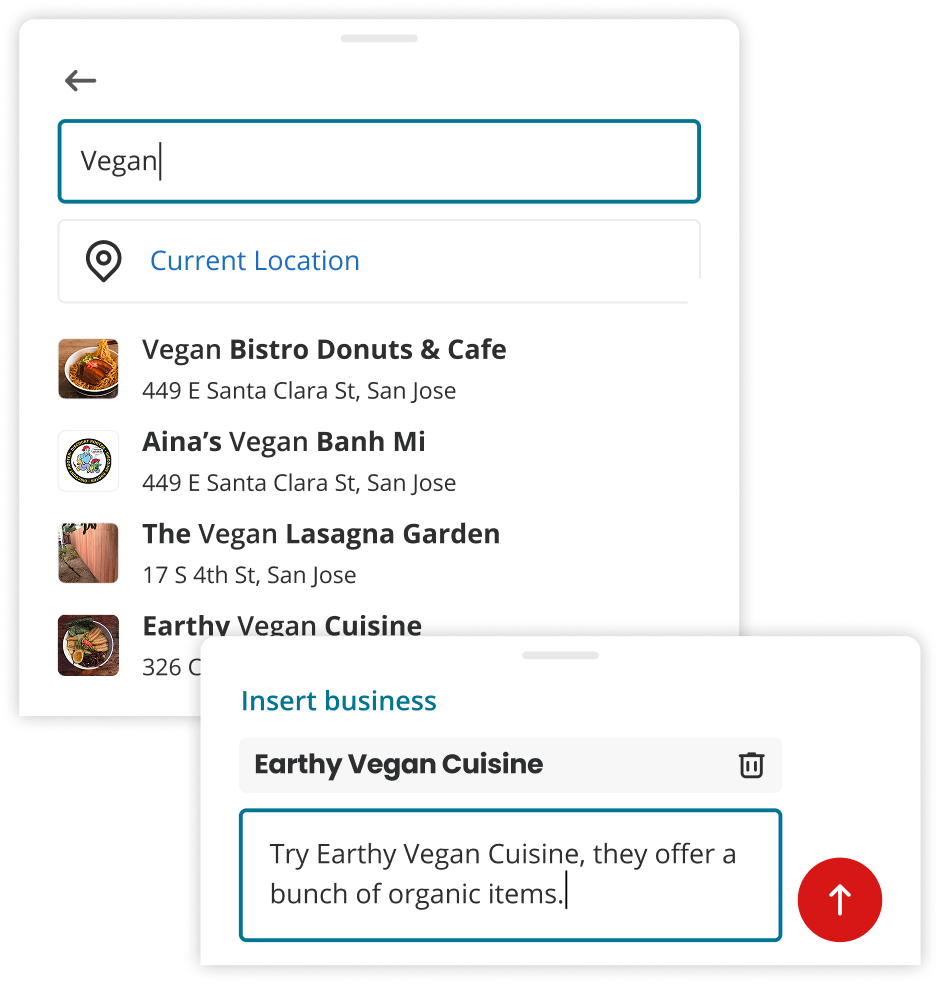
Questions and replies often had no clear connection to specific businesses, which made the content harder to navigate and less useful for people trying to make a decision.
Help users add business in their replies without feeling constrained or directed
Balance AI driven suggestions with user autonomy: the system should assist, not dictate
Introduce prompting in a way that works for all users, without overwhelming those who don't need it
Show the prompt upfront to prioritize education and drive feature adoption
Trigger tagging based on signals in the user's reply: helpful when relevant, invisible when not
Prioritize interaction quality over feature complexity, keeping the flow smooth and easy to follow
Dynamic prompt suggestions
Inline clarification cues
Structured composition flow with progressive guidance
To work through these interaction questions, I used lightweight prototypes to evaluate tradeoffs and land on clear, simple rules.
Decision: Removed manual location editing to keep the experience simple — location is inferred automatically.
Before: manual location selection added unnecessary steps
Decision: Used inline tagging to keep the flow focused and avoid breaking the user's train of thought.
Attachment style tagging: clunky to use and hard to maintain
Decision: Show business chips only before the user has tagged a business. So the chips are only needed as a starting point, not throughout the flow.
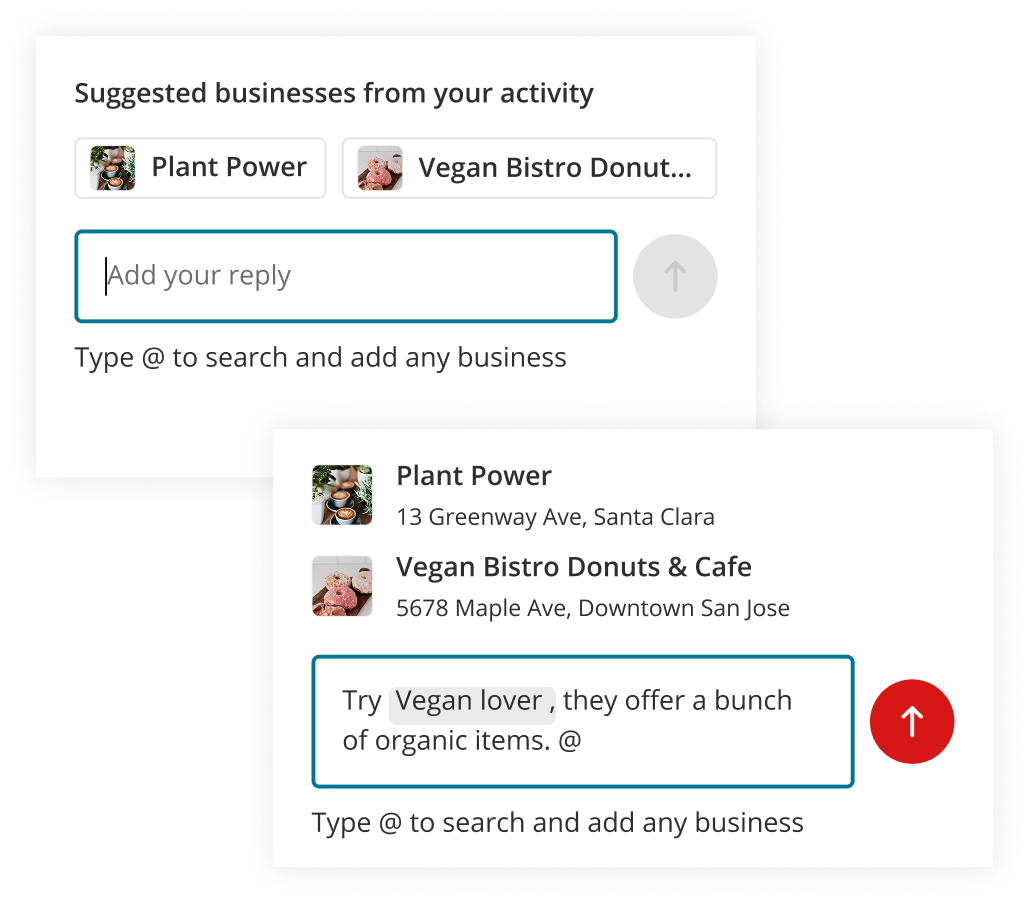
The suggested business shown as chips will be carried over in the default list after tapping @
Improved the quality and relevance of replies by grounding them in specific businesses
Strengthened the connection between Q&A content and the businesses being discussed
Improved the reader experience by making it easier to navigate directly to a relevant business page

We explored two placement models for reply-level reactions: one optimized for the current experience, and one designed to scale as more interaction types are introduced.
Built with future growth in mind — space for replies and additional interaction types as the system evolves.
Supports future interaction expansion
Clear visual separation between actions
Feels sparse in the current state when only have reactions

[🚫 Current state]
Reaction only
[✅ Future state]
Reaction + Reply
Optimized for the current experience with minimal visual overhead.
Keeps the layout compact
Feels natural when reactions are the only interaction
Avoids introducing empty or unused space
[✅ Current state]
Reaction only
[🚫 Future state]
Reaction + Reply
Made it easy for readers to show appreciation, closing the feedback loop for contributors
Added a lightweight interaction that increased engagement without requiring extra effort
Reinforced participation by giving contributors a signal that their answers were valued
Community Q&A launched as a new content type on Yelp — and the results showed it was filling a real gap.
01.
Q&A volume reached 10% of Yelp's review volume by Q1 2026, demonstrating that the community was willing to participate in a new way beyond writing reviews.
02.
The project unlocked a new contribution behavior at scale. Asking and answering questions became a meaningful activity for users who had never written a review before.
03.
Several interaction patterns developed for Q&A: including progressive tagging, inline prompting, and the question thread design, were added to Yelp's design system, giving future teams a reusable foundation to build on.
Building Q&A from scratch and seeing it reach scale taught me a lot about what it takes to introduce a new behavior to an established product.
01.
The pilot phase was the most important investment. Shipping something small and focused early gave us the evidence we needed to build with confidence. It's easy to skip validation when you believe in the idea — but the pilot is what turned belief into a credible direction.
02.
Designing for an existing ecosystem requires restraint. The temptation to invent new patterns is real, but fitting Q&A into Yelp's existing language made adoption faster and the experience more coherent. Novelty isn't always the right goal.
03.
Scale surfaces decisions you can't anticipate early. Many of the Stage 3 challenges, such as fragmentation, cross-surface consistency, contribution quality, only became visible once the product was real and growing. Staying close to the product post-launch was as important as the initial design work.